LaVida Massage
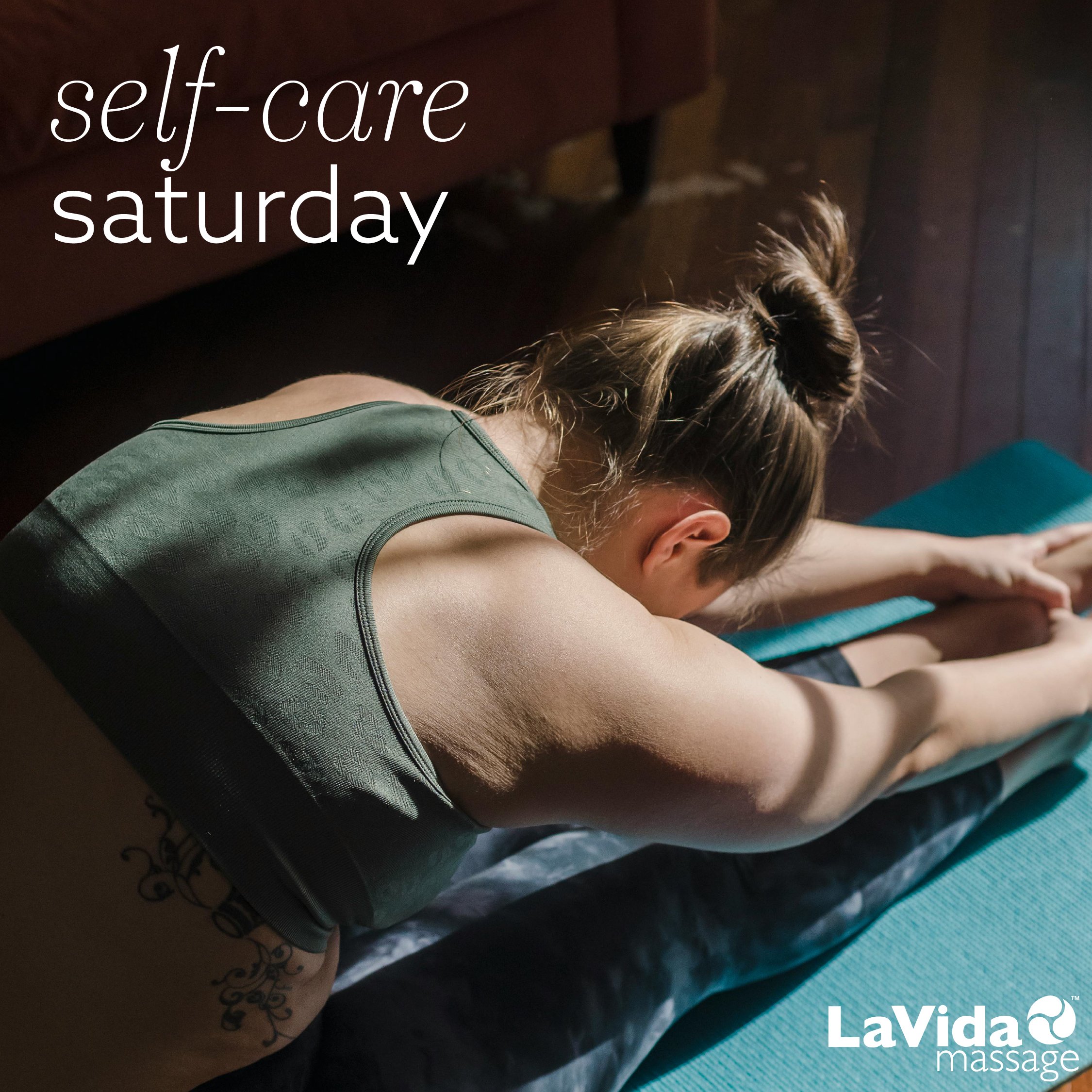
When I joined the team at LaVida Massage’s corporate office in early 2024, the main goal of their CEO and marketing team was to elevate the brand, taking over the helm from their previous designer. While the existing visual identity was clean, it wasn’t quite the impression they were hoping to give to guests, especially in competition with other massage franchises that espoused luxury wellness. The addition of a new typeface to the identity—Tenez Light Italic—functioned as an airy, elegant addition to the geometric, friendly Azo Sans. I also eliminated chunky boxes and blocks that weighed down the visuals of ads and printed materials, instead opting to use full-bleed photographs with plenty of breathing room and white space.